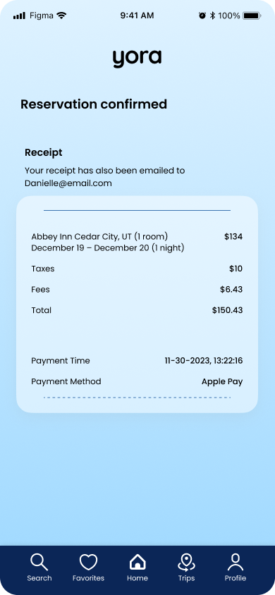
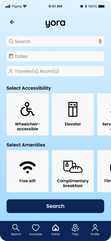
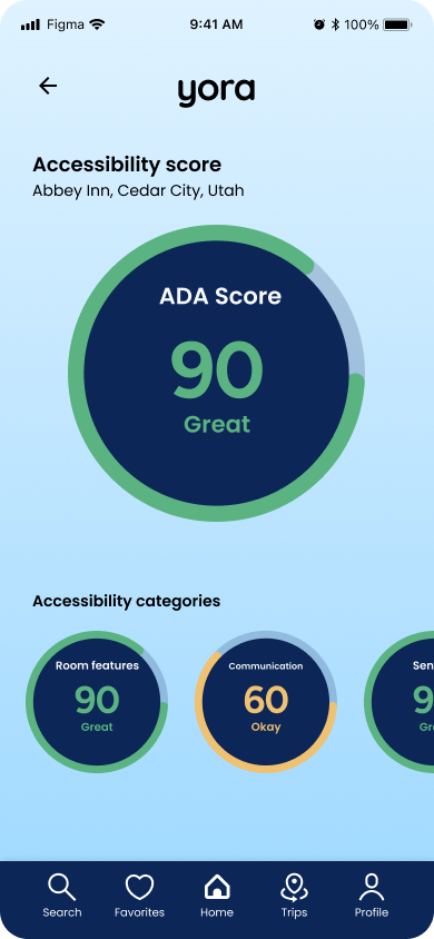
yora is a travel app concept designed to prioritize accessibility, developed as part of my User Experience Design Certificate course at Cornell University.
From the outset, I was driven by a genuine passion for creating solutions to support individuals with accessibility challenges during their travels. My research revealed a significant gap in the market: there are no comprehensive travel platforms specifically tailored to individuals with impairments or disabilities.
yora aims to address this by reducing travel barriers and raising awareness about the unique challenges faced by this demographic. Guided by the project statement—Throughout the travel planning process and actual travel, individuals with disabilities encounter numerous obstacles. A dedicated application can provide these users with essential tools, resources, and reliable information to navigate their journeys more seamlessly—yora seeks to empower travelers with disabilities through a holistic approach that includes improving infrastructure, enhancing services, and fostering greater awareness and training within the travel industry.
By addressing these needs, yora takes a meaningful step toward making travel more inclusive and accessible for all.
Project: Cornell University UX Design Certificate
Year: 2024–2025
User group & problem space
User group: Individuals with impairments and disabilities, elderly travelers, caregivers and companions, service animal owners, and travel agents.
Problem space: Travelers with disabilities face numerous challenges, both during the planning process and while on the move. Accessible transportation is often limited, and public spaces frequently lack adequate ramps, elevators, and pathways. Hotels may misrepresent their accessibility, and information access can be hindered by the absence of audio descriptions. Public restrooms are often poorly equipped, and venues like theaters and restaurants may offer limited accessible seating. Additionally, these travelers may encounter discrimination, financial constraints, health and safety concerns, and difficulties navigating legal and cultural challenges abroad.
Research & methodology: Ethical considerations
-
I promoted my research through a comprehensive outreach strategy, leveraging platforms like social media, disability advocacy organizations, community centers, and healthcare professionals to reach a diverse audience. My recruitment materials were inclusive, using thoughtful language to ensure no group was prioritized over others.
-
I used accessible consent formats, including large print, audio, videos, and direct interaction, with proxies for those with cognitive impairments. If children were interviewed, consent was obtained from a parent or guardian and explained in age-appropriate terms.
-
The consent form stated that participation was voluntary, with the option to withdraw or skip parts of the study without consequences. It was available in multiple formats, and I emphasized this throughout the study while fostering a supportive, non-judgmental atmosphere.
-
Participants were monolingual or multilingual, using sign language or braille as needed. Materials were provided in preferred languages and formats, using simple language and avoiding complex terminology to accommodate varying literacy levels.
-
Participants had firsthand experience with travel accessibility challenges and provided valuable insights. I emphasized the importance of their feedback, used clear and respectful language, and created a supportive environment to encourage open communication, highlighting how their input led to tangible improvements.
-
Before my case study, I researched disabilities, travel obstacles, and individual needs through case studies, ADA guidelines, and advocacy experts. I respected autonomy and collected necessary health data to ensure inclusivity and tailored app features.
-
I collected personal health information to customize the app's features and accessibility requirements to enhance the user experience. All data was stored securely in a password-protected, encrypted Dropbox file, with explicit participant consent obtained beforehand and handled with confidentiality and respect.
-
I secured participants' data in an encrypted, password-protected Dropbox file with exclusive access and communicated this before obtaining consent. The study was voluntary, conducted with respect, and provided a supportive environment to address sensitive topics without stigmatization.
-
The study provided benefits like improved accessibility for participants and increased inclusivity for society, with risks outweighed by proper management. Ethical conduct and prioritizing participants' needs were key to justifying the project.
Research & methodology: Recruitment
Participants were recruited through social media platforms like Facebook support groups for individuals with disabilities, online advocacy forums, and partnerships with companies such as We Co, which provide accessibility reviews. Interviews took place either in participants' homes or virtually via Zoom for those preferring or needing remote participation. Each interview lasted between 45 minutes to an hour, depending on participants' needs, to explore their pain points and gather insights. Consent was obtained through accessible formats, including digital consent forms and audio recordings for verbal consent. Data collection involved audio or video recordings, with comprehensive note-taking, and video recordings were used when agreed upon by participants. Data from survey participants was collected from their completed submissions. Ethical considerations were fully addressed throughout the process.
Research & methodology: Contextual interview
The following questions were developed for the contextual interview process. Three individuals who met the user group criteria were recruited to participate, and data was extracted from their interviews through affinity diagramming.
What is your name?
What is your age?
If you have an occupation, what is it?
What kinds of accessibility requirements do you have, if any?
Do you use any accessibility tools to help you use mobile apps or websites?
Do you like to receive visual, sound, or touch feedback in mobile apps or websites?
What device do you prefer to use when travel planning?
When traveling to a destination, how do you prefer to get there?
What type(s) of transportation to you like to use once you’ve arrived at your destination?
How do you usually check if a place is accessible for you?
Are there any places that are hard for you to access while traveling?
Can you share a recent difficulty you encountered while planning a trip?
What emotions did you go through while planning your most recent travel?
What features do you consider most important in a travel app?
What is your preferred way to get travel updates?
What is your preferred way to communicate with customer service?

Through contextual interviews and affinity diagramming, I learned that people often start travel planning excited, but this enthusiasm quickly turns to anxiety, stress, and frustration as they face concerns about trip disruptions, travel scams, and being overwhelmed by excessive information and time constraints. Participants typically turn to Google, official websites, and user reviews for accessibility information, but inaccurate or outdated details lead to frustration when destinations don't meet their needs.
There is a clear need for a solution that provides accurate, concise accessibility information. Most participants prefer chat, email, or text over phone communication but still want to interact with a real person. In terms of transportation, users use various options, from driving to planes, buses, and ride-sharing services like Uber and Lyft, though many prefer walking depending on the environment. Affordability is a key factor in transportation decisions, which should be considered in the design process.
User persona

User requirements
Functional
-
Description: The app must allow users to create profiles where they can specify their accessibility needs, preferences, and travel history for personalized recommendations.
Rationale: Allowing users to create profiles helps tailor the app experience to individual needs, enhancing user satisfaction. By specifying their accessibility requirements and preferences, travelers can receive personalized recommendations, making it easier to find suitable services and reducing planning time. -
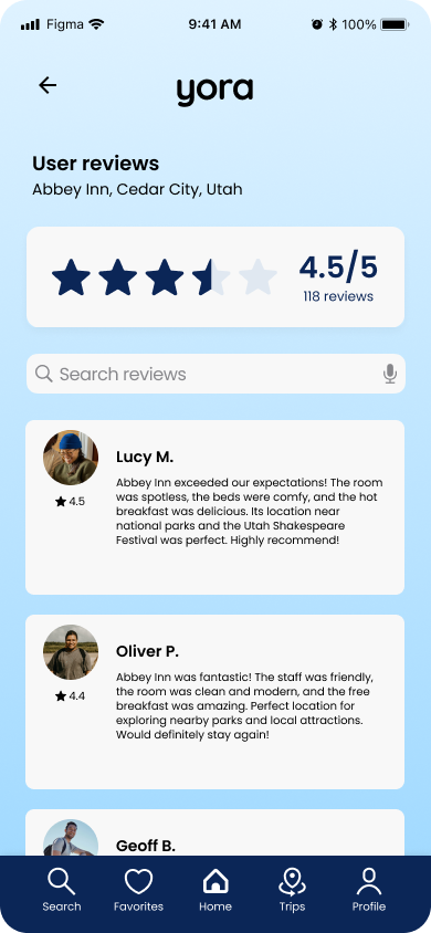
Description: The app should enable users to submit reviews and ratings of accessible services.
Rationale: Enabling users to submit reviews and ratings fosters a community-driven approach to sharing knowledge about accessible services. This peer feedback helps future travelers make informed decisions based on firsthand experiences, ensuring they choose the best options for their specific needs. -
Description: The app should include an itinerary planning feature.
Rationale: An itinerary planning feature assists users in organizing their travel arrangements effectively, ensuring that all aspects of their trip—such as accommodations, dining, and activities—are accessible. This holistic approach simplifies the planning process, reducing anxiety and enhancing overall travel experiences for individuals with disabilities. -
Description: The app should offer a live chat feature that connects users with support representatives.
Rationale: Providing live chat support connects users with knowledgeable representatives who can answer questions and provide immediate assistance regarding accessibility resources. This feature enhances user confidence and satisfaction, as they have direct access to expert guidance when needed. -
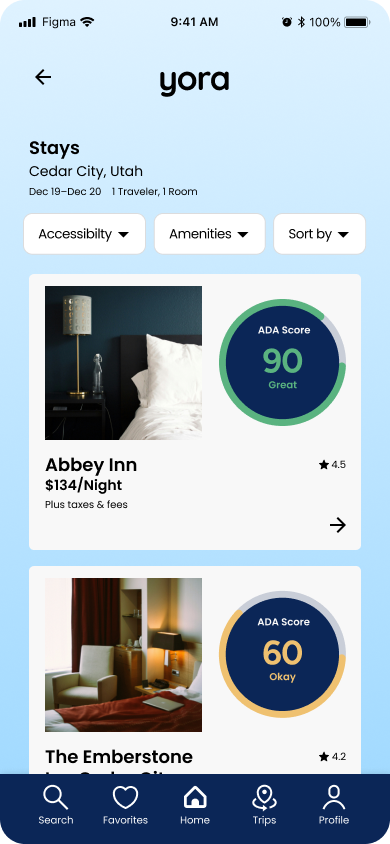
Description: The app should provide interactive maps highlighting accessible routes, restrooms, and facilities in various locations.
Rationale: Interactive maps that highlight accessible routes, restrooms, and facilities empower users to navigate unfamiliar environments confidently. By visualizing accessible options in real time, travelers can make informed decisions about their routes, enhancing their overall travel experience and independence. -
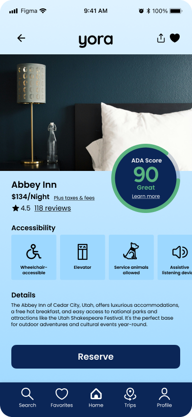
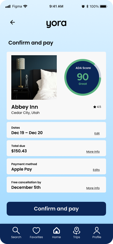
Description: Users should have the ability to book accommodations, transportation, and activities directly through the app, with clear information on accessibility features.
Rationale: The ability to book accommodations, transportation, and activities directly through the app streamlines the travel planning process for users, particularly those with disabilities who may face additional challenges. By integrating booking functionalities, users can secure their arrangements in one place, reducing the stress of coordinating multiple platforms. Additionally, providing clear information on accessibility features within the booking system empowers users to make informed decisions that best suit their needs. This not only enhances user confidence and satisfaction but also encourages greater engagement with the app, as it becomes a comprehensive resource for all aspects of their travel experience. Ultimately, this functionality promotes a more seamless and accessible travel experience.
Contextual
-
Description: The app should establish partnerships with local hotels, restaurants, and transportation services to ensure up-to-date and accurate information on accessibility features.
Rationale: Establishing partnerships with local businesses ensures that the app provides reliable, real-time information about accessible services. This collaboration helps maintain accuracy in listings, allowing travelers to trust the information presented and making it easier for them to plan their journeys confidently.
Functional -
Description: The app should offer multilingual support to accommodate travelers from diverse backgrounds.
Rationale: Offering multilingual support is essential for catering to a diverse user base, as travelers come from various linguistic backgrounds. This inclusivity ensures that all users can access important information about accessibility, enhancing their experience and reducing barriers for non-native speakers. -
Description: The app must adhere to international accessibility standards (e.g., WCAG) to ensure it is usable for individuals with various disabilities.
Rationale: Adhering to international accessibility standards, such as the WCAG, guarantees that the app is usable by individuals with various disabilities. This compliance not only demonstrates a commitment to inclusivity but also broadens the app’s reach, ensuring it can serve as a valuable resource for the widest possible audience. -
Description: The app should implement robust data privacy and security measures to protect user information, especially regarding sensitive accessibility needs.
Rationale: Implementing robust data privacy and security measures is crucial for safeguarding user information, particularly given the sensitive nature of accessibility needs. Users must feel confident that their personal details are protected from breaches and unauthorized access. This assurance fosters trust in the app, encouraging more individuals to engage with its features and services without fear of compromising their privacy. Additionally, compliance with data protection regulations enhances the app's credibility and demonstrates a commitment to ethical practices, further promoting user confidence and participation.
Sketches & storyboards
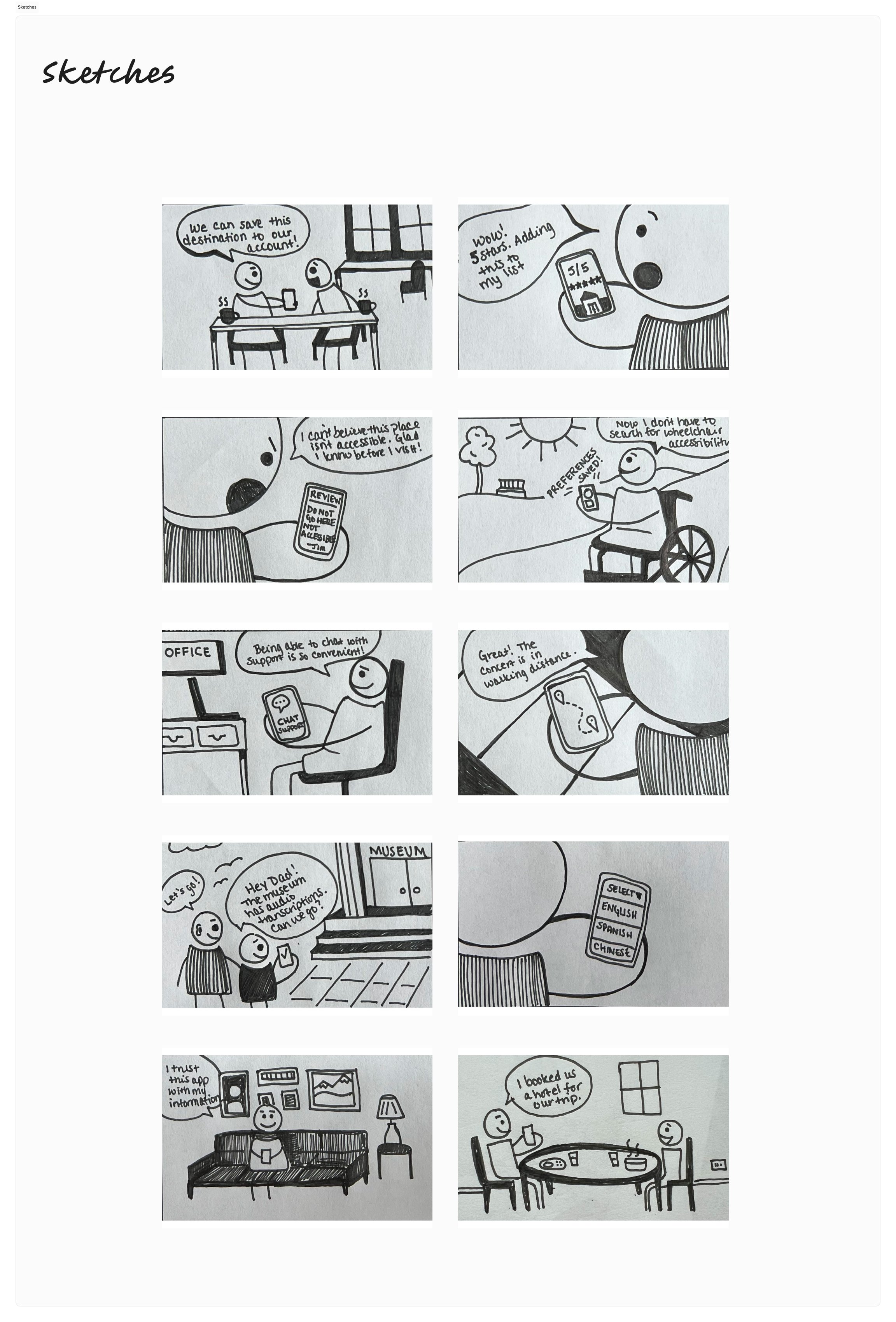
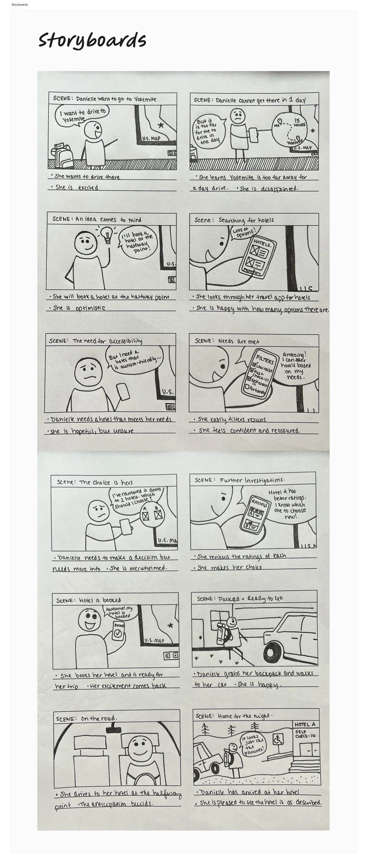


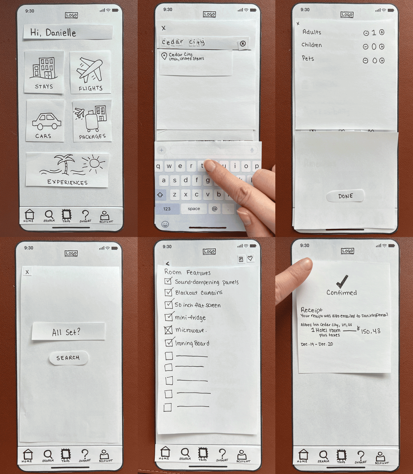
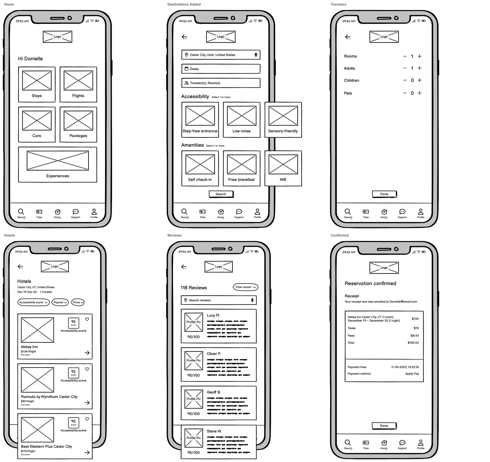
Low-Fidelity & Mid-Fidelity Prototypes: Booking process
Low-fidelity
Mid-fidelity
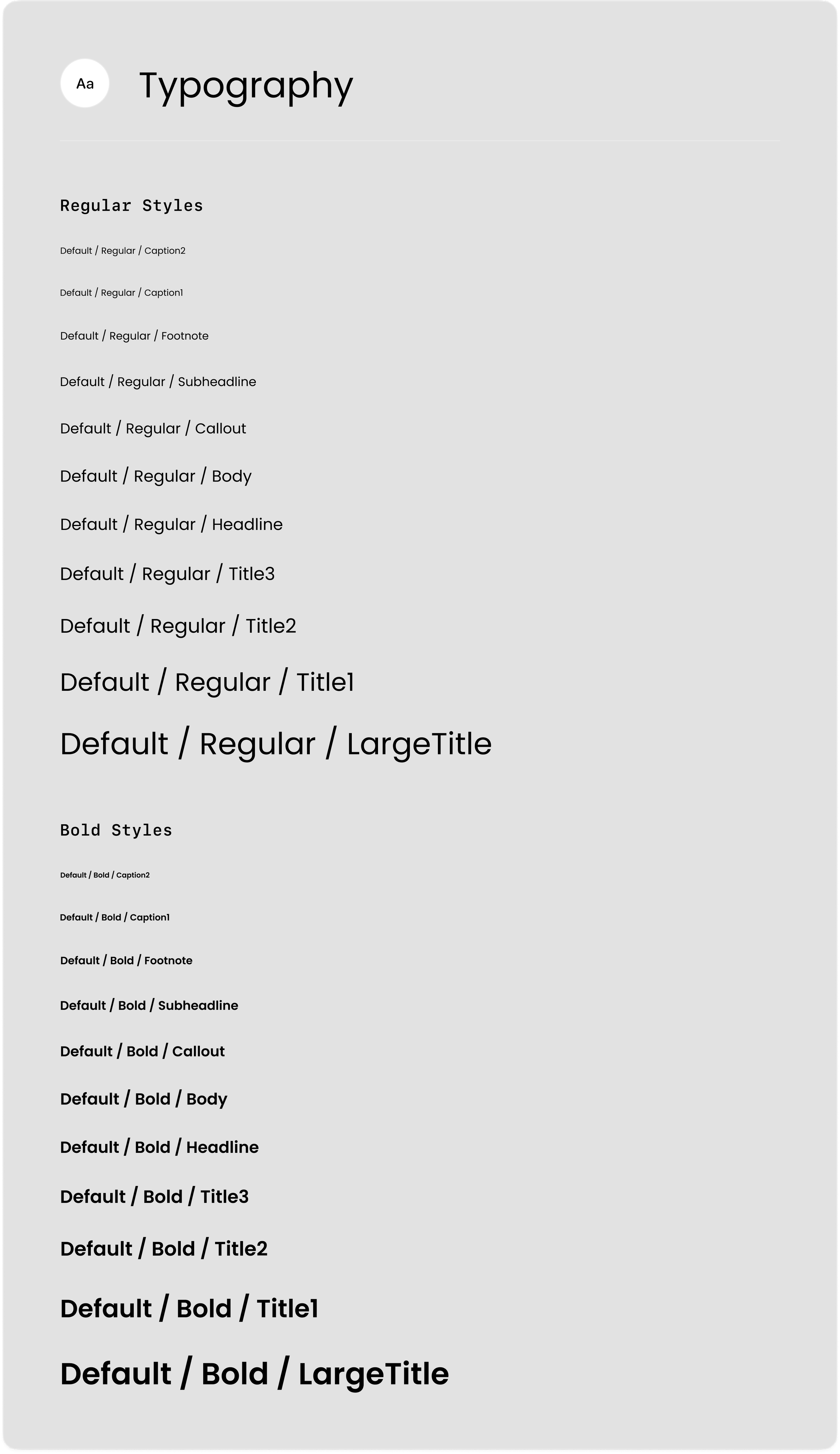
Design System
Typography
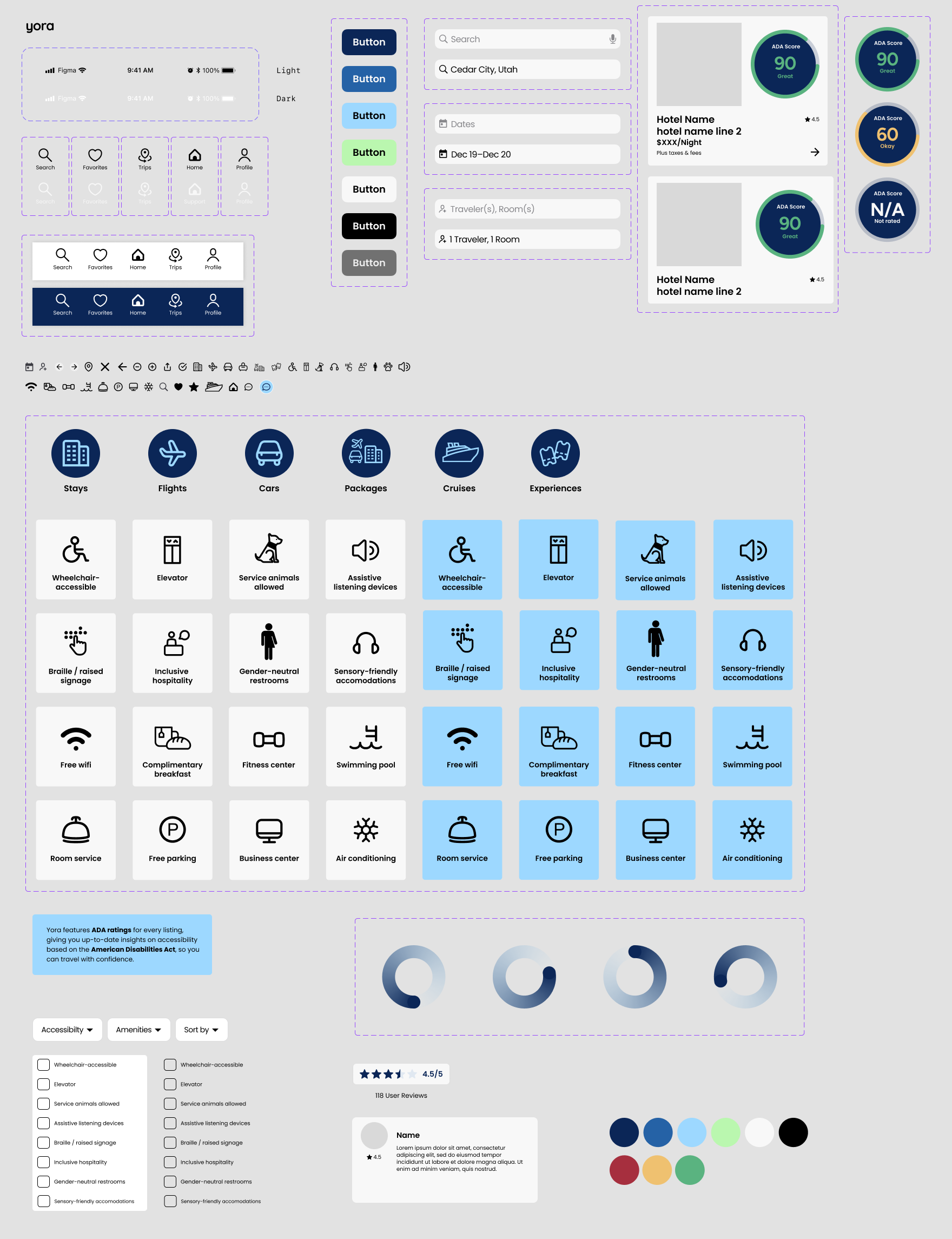
Components
High-Fidelity Prototype: Booking process
High-fidelity